|
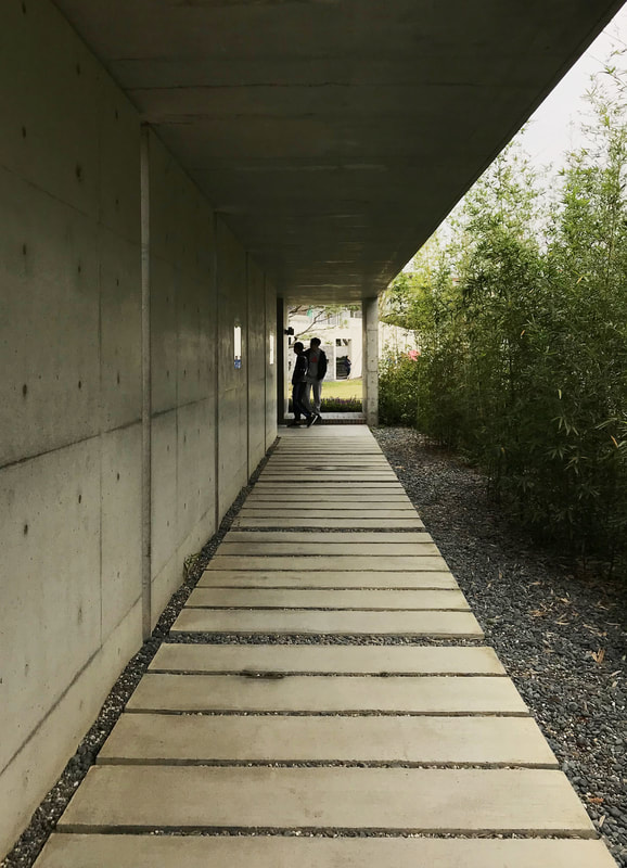
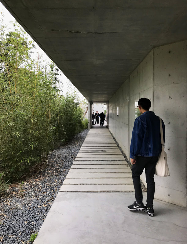
I visited Yu-Hsiu Museum of Art with the firm I'm currently interning at this past Friday. The project, however, was designed by another firm with architect W.L Liao. The architect's manifesto focuses on the identity of island architecture, its tropical environment and the rich historical context of Taiwan. His projects share similar complexity in materiality with strong contrasting sculptural forms. The museum sits on a mountain hill with 7 meters difference from the bottom to the top. The project consists of three components: the museum, a cafe, and an artist residential unit. Each has a distinguish appearance yet shares similar materials. They took on an archipelago-type composition instead of physically linking to each other. 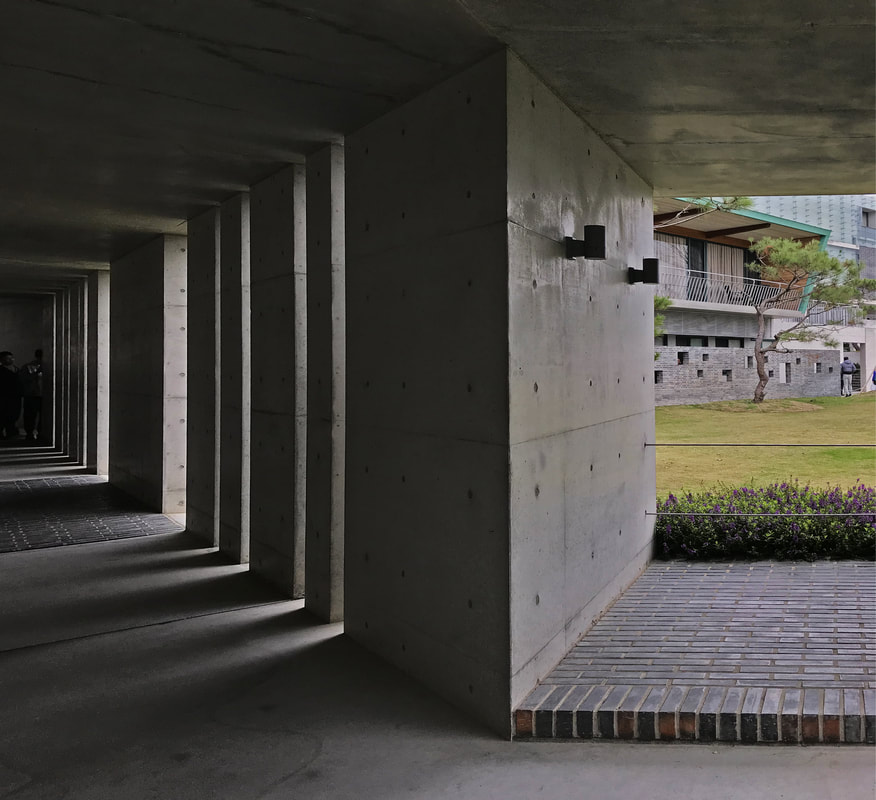 The entrance sequence is inspired by a traditional chinese architectural technique, to suggest circulation and control visibility. I like the vertical rhythm in the hallway, it reflects on the tropical island context perfectly, it's a shame that this language does not continue as you walk further down into the rest of the project. 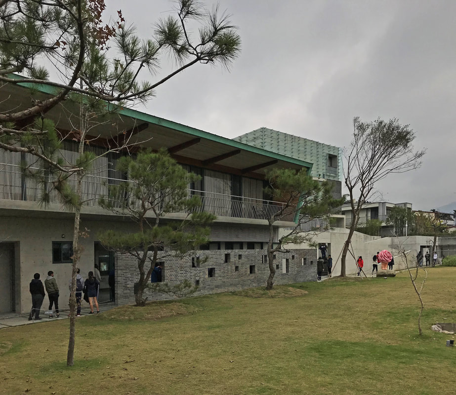 After the hallway is the residential area and shop, like I stated, I wish that verticality could continue on that brick wall somehow, instead of the jumping corbusian openings. 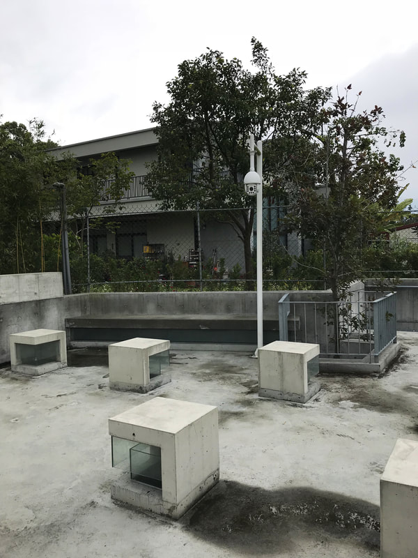 The above is an excellent example of architect and construction side collaborating with each other. The idea was discussed on site— they turned bunch of light wells into seatings. It fits well with the context and the archipelago-type composition of the overall project. 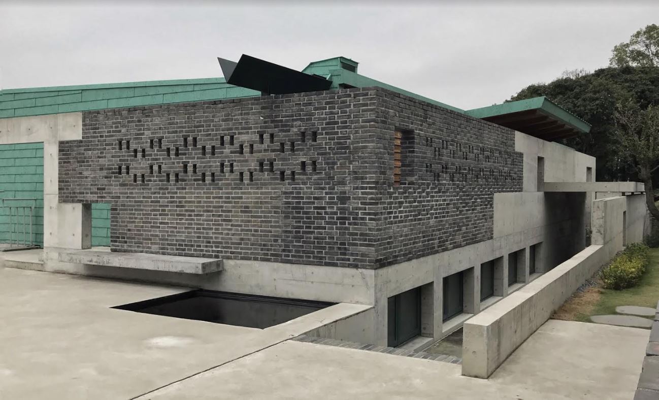 Above is my favorite corner of the place. It reminds me of Frank Lloyd Wright's Taliesin West somehow with the sunken building and side openings and the elongated volume, even though two projects have very different context to begin with. The sculptural gutter provides a playful tone to the organized forms, yet it doesn't seem out of the place because of its minimal design. I also like how the materials are connecting to each other and revealing what's behind, it's a very Scarpa thing to do. 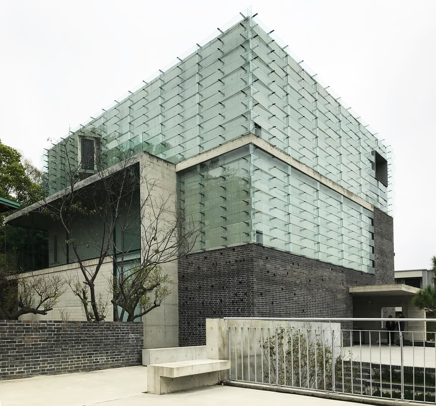 At last, it's the museum itself. The use of glass panels as facade to minimize the visual impact with the surroundings is a good touch, unfortunately, I think that line of concrete floor slab ruined the aesthetic. That floor slab popping out is out of the place and it cancels the effect they tried so hard to achieve. The building would have a much more monumental and pristine presence without that distracting plane. I am not sure if it's a construction decision since I do not see it on the design model. 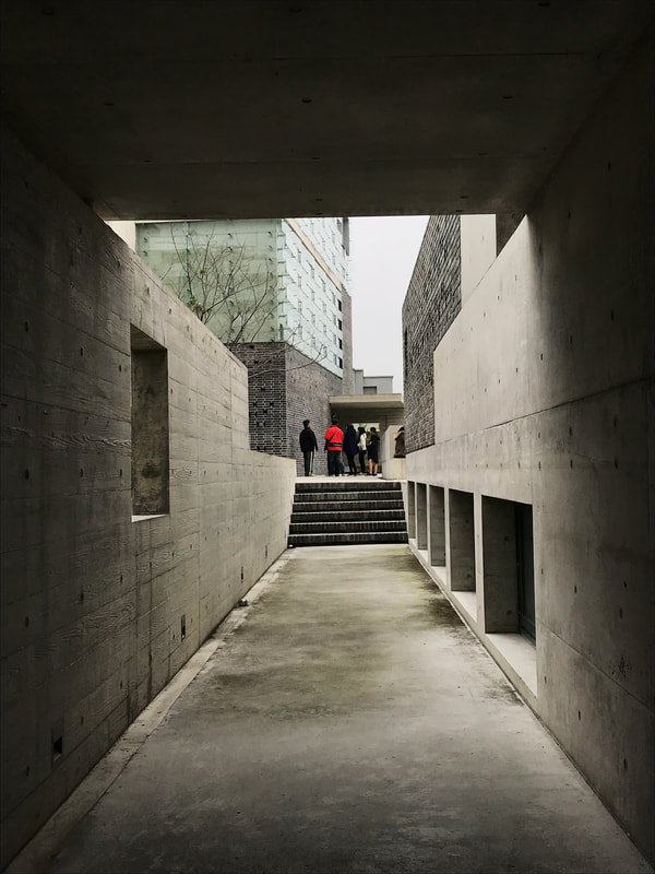 They do not allow photography within the museum so I did not take any interior shot, but I do highly recommend visiting the museum because the architect manipulated the space pretty well with tectonics and solid/void spaces.
Overall I think it's a great step up for Taiwanese public architecture. The building was awarded the best Taiwanese architecture award in 2016. The building strives for both functionality and aesthetic with emphasis on materiality. However, I feel like although the project consists of many beautiful spaces, they don't necessary read well to each other. You can even say the architect "over-designed" certain parts. One can definitely argue it with the idea of tropical island complexity, but often time I feel like the architect is too eager to show off his design ability. (I still like the place don't get me wrong.)
0 Comments
Leave a Reply. |
AboutThis blog was launched in August, 2015 during my 8th year of studying abroad in Barcelona, Spain. I decided to start this blog and record some of my thoughts and moments. This blog is also dedicate to Richard Fu, a good friend of mine who is now guarding me from above. He inspired me to get out of the comfort zone and be curious about the world. Amig@'s blogs
Check out my brother Will's blog (in Mandarin) to see what he's up to these days (Design, fashion, food, technology, music, film...etc) Check out Kris' website for some high quality photos around the world Archives
September 2023
|


 RSS Feed