|
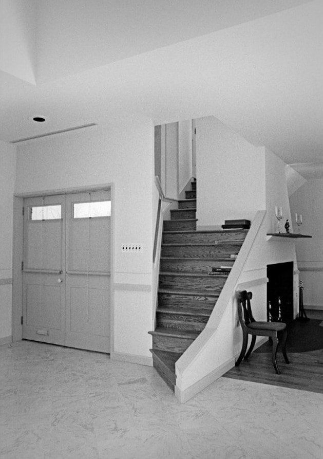
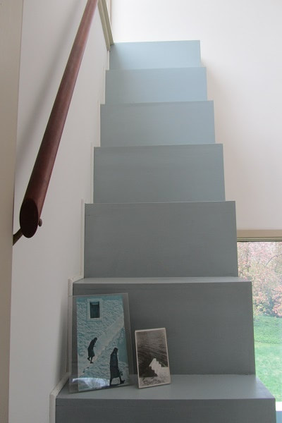
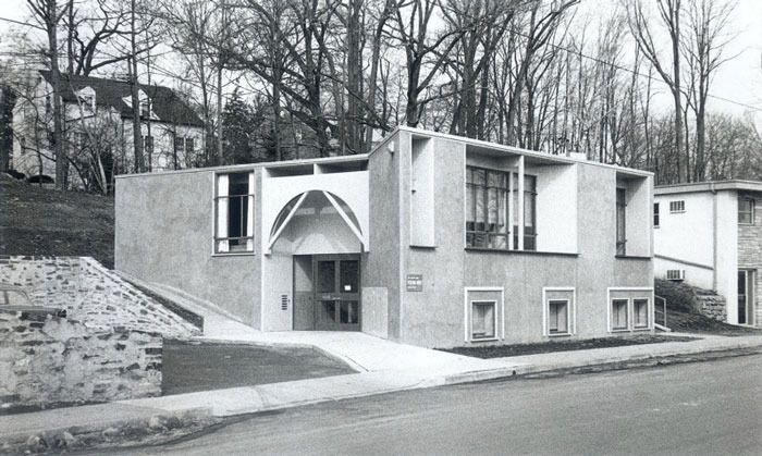
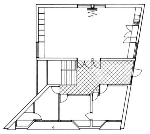
I attended another lecture by prof. C.D Tseng of NCTU. The topic this time is to compare and contrast Vanna Venturi House by Robert Venturi with House VI by Peter Eisenman. 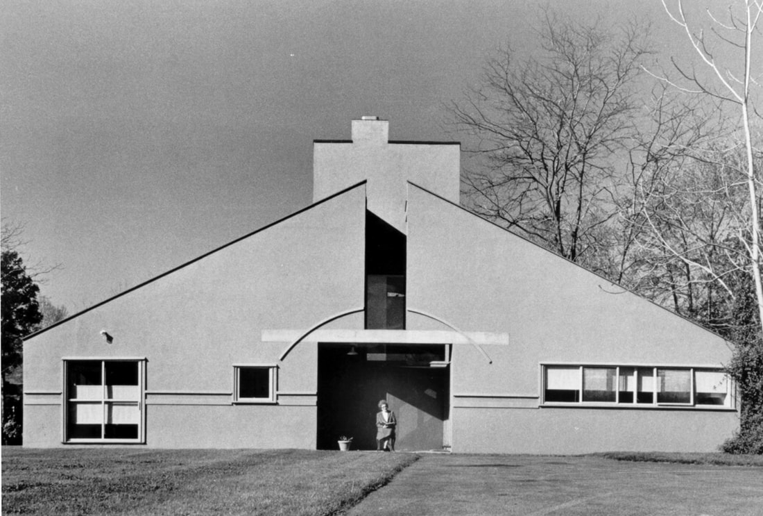 Robert Venturi's mother Vanna sitting in front of the house. Vanna Venturi House If we ought to understand Venturi's work, we have to mention his mentor back at U Penn, architect Louis Khan. Robert Venturi got a lot of influence from his mentor, including the using of diagonal wall placement to create an effect of a surface and perspective, and also grouping all the service programs at one side of the project. 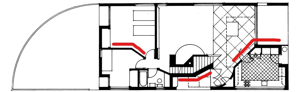 The use of angled walls in Vanna Venturi House. Robert Venturi's architecture grand tour in Rome, Italy impacted his design method significantly as well. He carefully studied the 'in-between walls space' of all the Roman and greek temples and thought about the possibilities from the poche area of the walls. In his book 'Complexity and Contradiction in Architecture', he stated: "...I speak of a complex and contracdictory architecture based on the richness and ambiguity of modern experience, including that experience which is inherent in art." The idea of richness and ambiguity can be seen from all his work, especially the ambiguity in symmetry and asymmetry. ...I speak of a complex and contracdictory architecture based on the richness and ambiguity of modern experience, including that experience which is inherent in art. -Robert Venturi 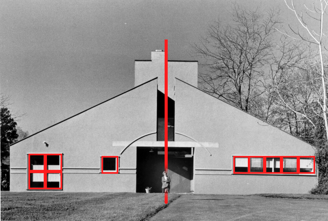 Let's look at the same photo again, but this time with some visual guides. We can see both sides have equal amount of windows with equal amount of areas, but in different arrangement. We also see he offset the chimney and the plant away from the center line of the building to create a certain ambiguity. And finally, he asked his mom to sit at the center line to complete the whole image. 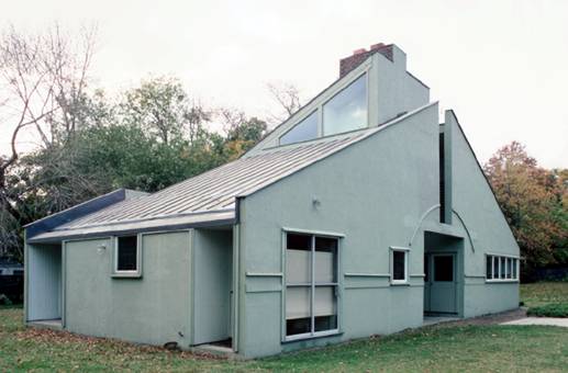 One of the characteristics of PoMo buildings is the use of facade as a skin of the building. The project is sandwiched by two thin skins, yet one represents modern and one represents classical elements, and in between is another architectural language. We can also go back to that 'in-between walls' idea I just mentioned and interpret it that way. 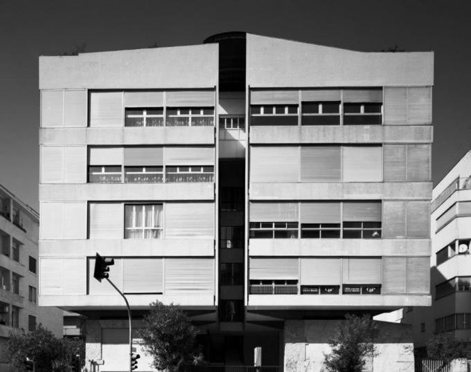 You can see Vanna Venturi House is also inspired by Luigi Moretti's apartment project with that ambiguity: Is it an apartment splited in half? or do you read it as two apartments glued together? More contradictions inside the house, part of the stairs from 1st to 2nd floor got eaten by the chimney space and become extremely narrow. There is another staircase on the 2nd floor that leads to a dead end wall, which is inspired by Michelangelo's work. We also covered another project of Venturi, the Headquarters Building for North Penn Visiting Nurse Association. The project is context-oriented with respect to the landscape and the adjacent buildings. It chose to have a humble facade to match the neighborhood, yet it has a certain monumentality to emphasize its position as an institution with the dramatic windows at the front facade. The floor plan can be read as a perfect rectangle with a pull from the landscape and skewed into the current form, and he carved in the entrance so it can face towards the parking lot and the same time created a small drive way. We also looked at his public building, Sainsbury Wing at the National Gallery London, where he created that contradiction from classical elements. The piece was very provocative at the time and received different opinions. 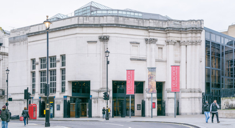 House VI Similar as Louis Khan to Robert Venturi, Colin Rowe was Peter Eisenman's mentor back in the school, and had lots of influence for him. Casa del Fascio is the project that influenced Eisenman immensely during his student phase. The building was completed in 1936 for the National Fascist Party in Italy. The exterior facade of the building is asymmetrical, yet the interior floor plan is symmetrical following the Palladian style layout. This sort of juxtaposition of transparency and the mixed of architectural languages were what inspired Eisenman. We can see later his House I and House II have this characteristic of mixing column grid with shear wall grid. 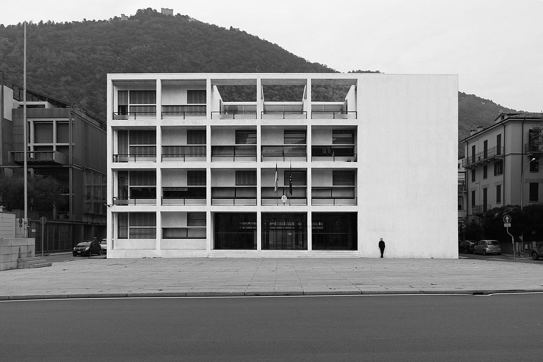 Casa del Fascio. Front Facade. 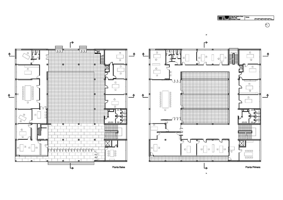 Floor plan of Casa del Fascio. For Peter Eisenman, materiality is not something he'd care about. He likes pureness, paper-like architecture. He likes the relationship between solid and void. He likes the composition of walls and columns. He is using architecture as a medium to interpret linguistics. Similar to Robert Venturi, they think of architecture not as the traditional sense of what a building should look like, but decrypted it and put it back together as an experiment. 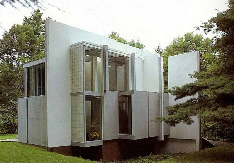 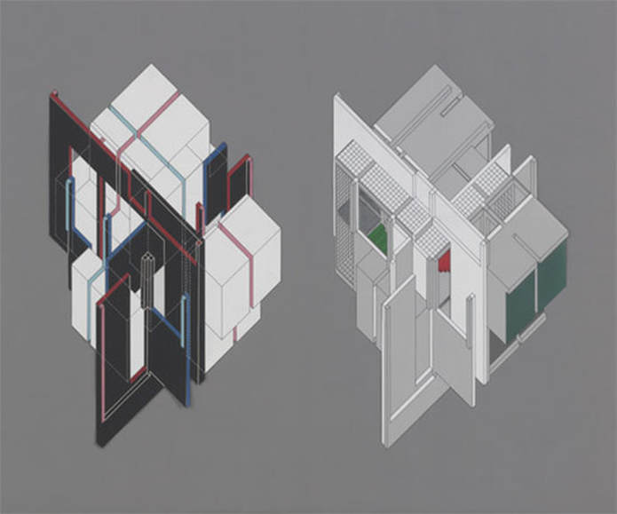 The project is very provocative because it is challenging people's common knowledge to architecture with his idea of literariness. The house is juxtaposed with a 3x3 and 4x4 grid. There is no top and bottom relationship. There is no left and right relationship. Some walls don't reach the ground. Some columns don't connect. And one stair-case is upside down because at one point the building was designed upside down. This sort of estranging and defamiliarizing architecture is Eisenman's way of showing us the potentiality of architecture. 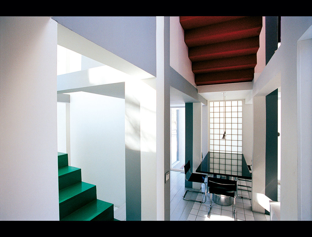 The red stair-case that proves if you flip the entire house upside down it can still function. 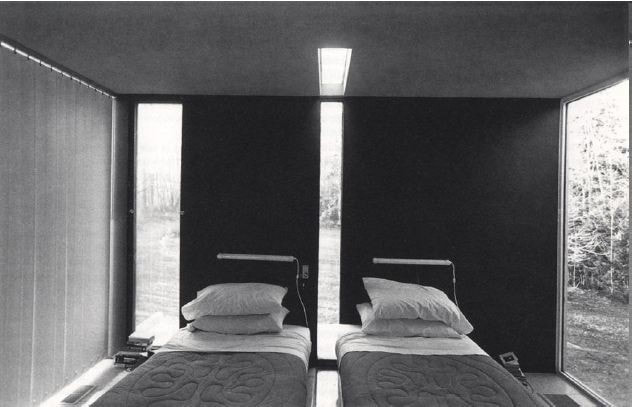 The husband and wife are forced to sleep on different beds. Robert Venturi and Peter Eisenman deconstructed architecture into linguistic elements and "re-phrase" it into their ideal architecture. The projects don't necessary function well, but it's a dawn of a new discourse, and its influence is still lasting in today's architecture profession.
0 Comments
Leave a Reply. |
AboutThis blog was launched in August, 2015 during my 8th year of studying abroad in Barcelona, Spain. I decided to start this blog and record some of my thoughts and moments. This blog is also dedicate to Richard Fu, a good friend of mine who is now guarding me from above. He inspired me to get out of the comfort zone and be curious about the world. Amig@'s blogs
Check out my brother Will's blog (in Mandarin) to see what he's up to these days (Design, fashion, food, technology, music, film...etc) Check out Kris' website for some high quality photos around the world Archives
September 2023
|
 RSS Feed