|
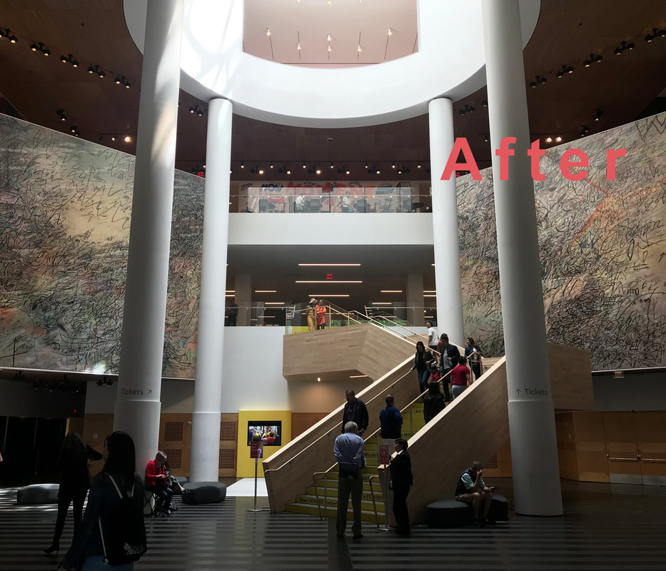
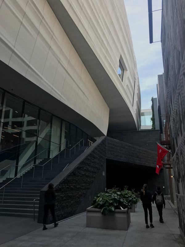
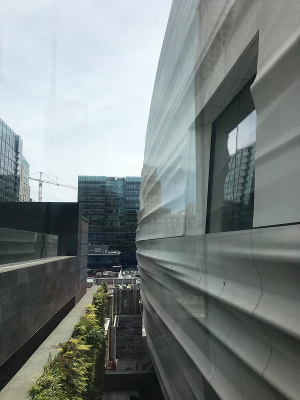
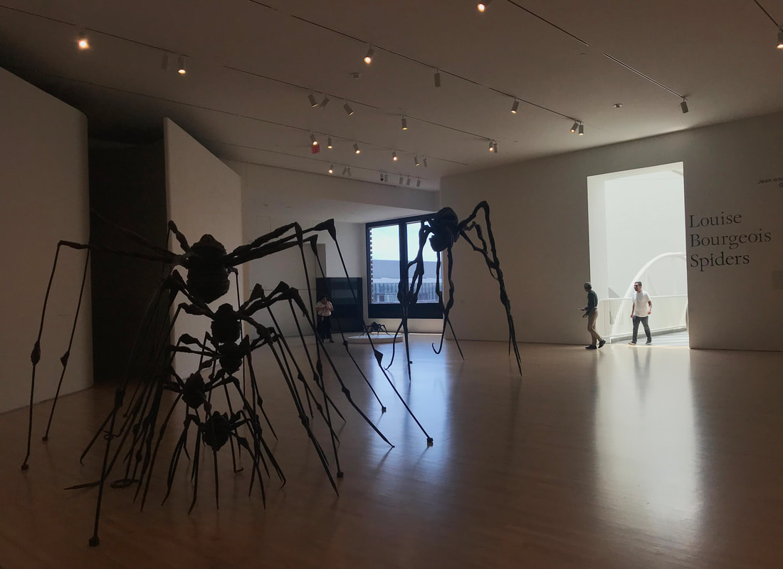
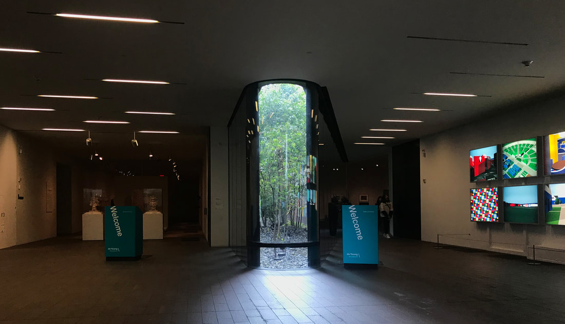
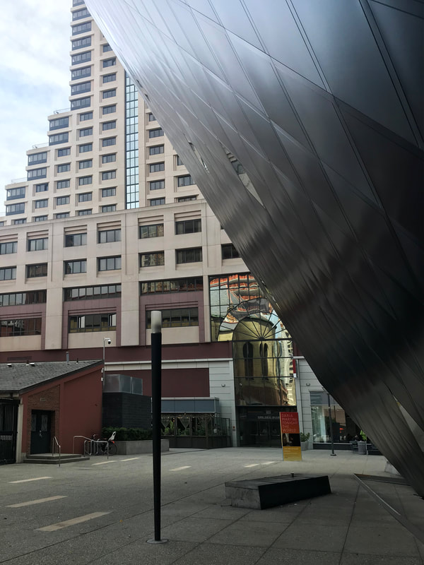
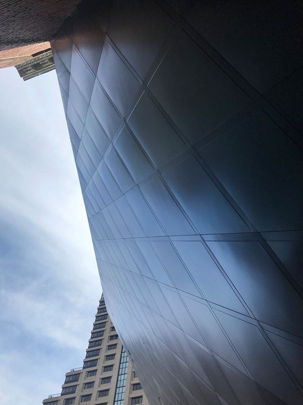
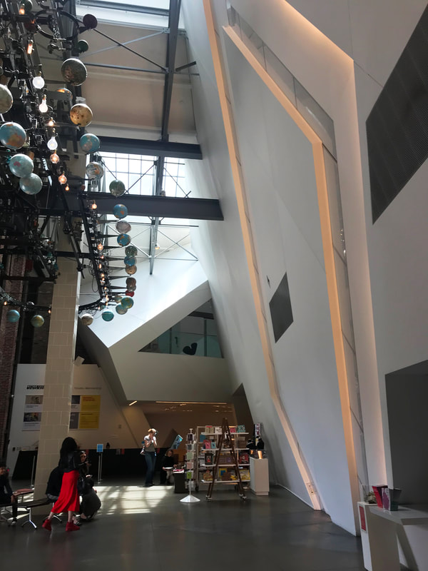
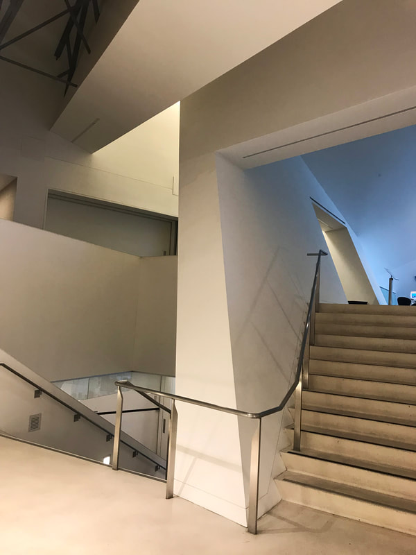
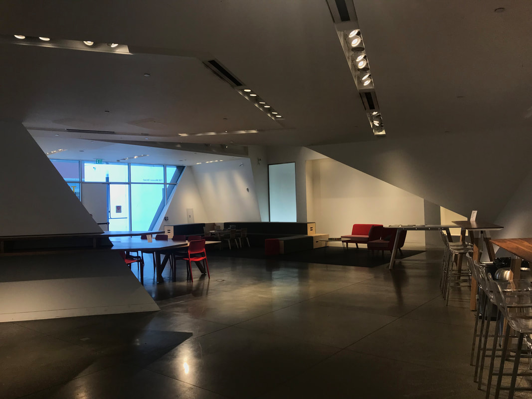
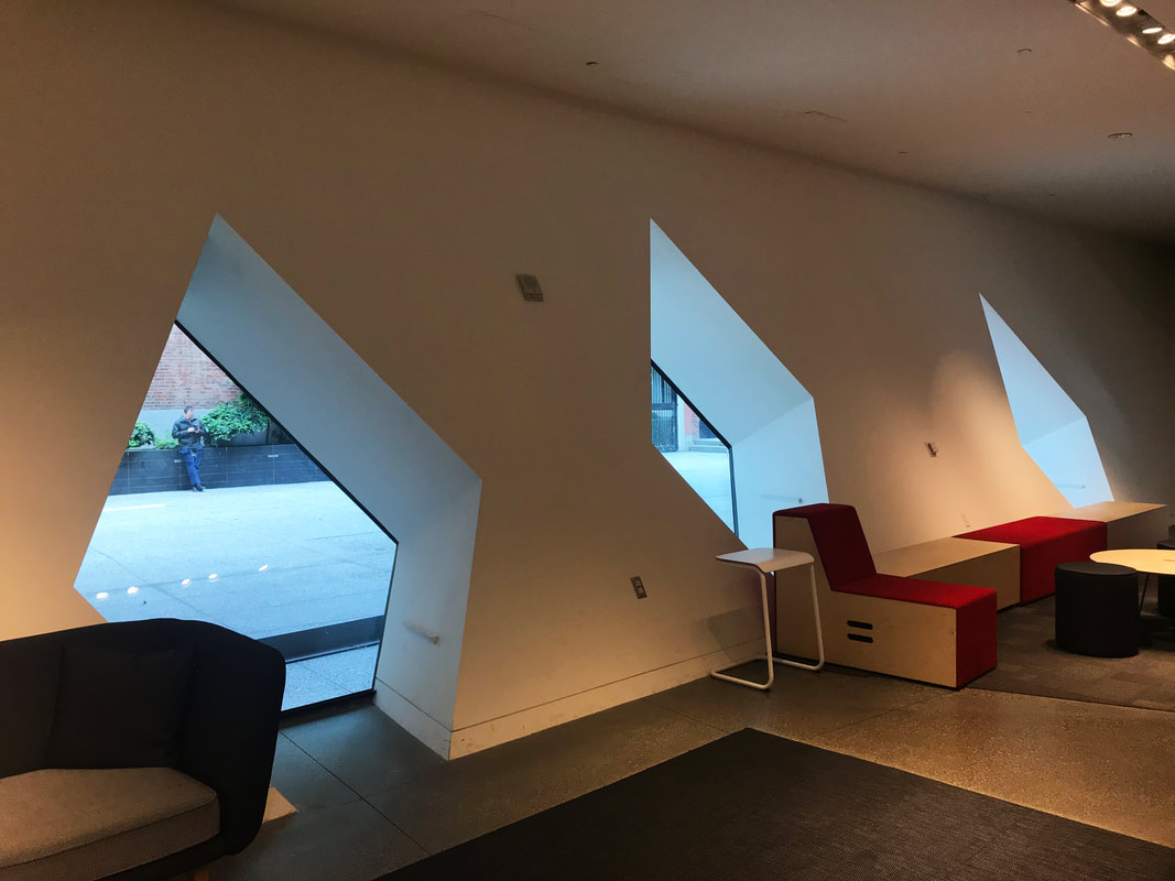
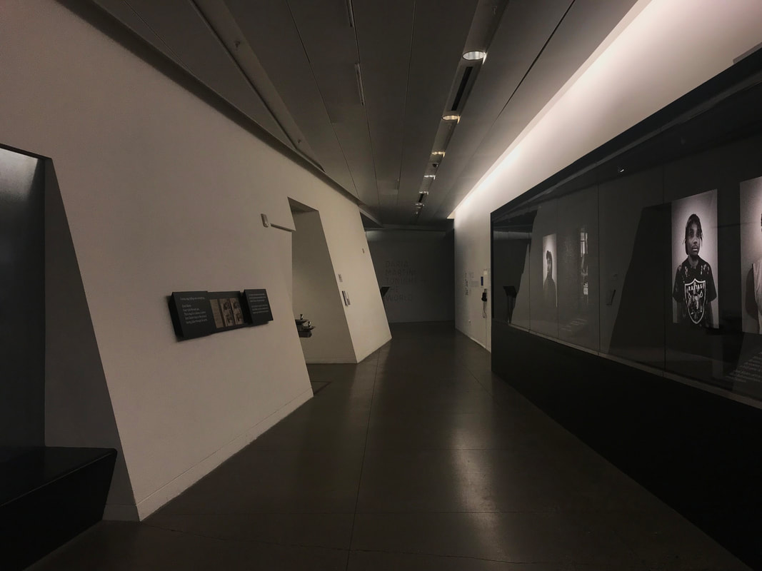
It's a rather stress-free summer this year after obtaining my Master degree besides the endless wait on the EAD card. I got to attend my first American wedding in French Lick, Indiana. Austin and Lindsey's wedding was absolutely phenomenal with lots of emotional moments. It was also a great time to catch up with friends from grad school since I didn't get to graduate with them last year. The second wedding I got to attend this summer was Steve and Victoria's, and thus, I got to visit San Francisco for the third time. Steve and Victoria's wedding was extremely creative, families and guests got to tour around the city with many surprises along the way. I am truly truly happy for both couples and wish them the best!! I was originally planning to visit Brazil this summer for research if I were granted the Ryerson Traveling Scholarship, but that plan ultimately fell through and I wasn't going to put myself at risk for the U.S re-entry so this trip to California sort of fulfilled my need to explore. Shoutout to all the people who host me during the San Franisco trip! Shoutout to my cousin, Jeff, Malenie, bro Chao, Steve, Victoria, and Vivian. This blog post is structured into two parts, first part talks about some of the buildings I visited during the trip. These buildings are all somewhat related to each other because they all inherited certain context from the previous buildings on the site so it's interesting to put them together to compare and contrast. The second part focuses on the city, San Francisco, itself. There are some social and urban issues I'd like to discuss, which I wasn't able to identify during my last visit. San Francisco Museum of Modern Art / Mario Botta 1935 & Snøhetta 2016 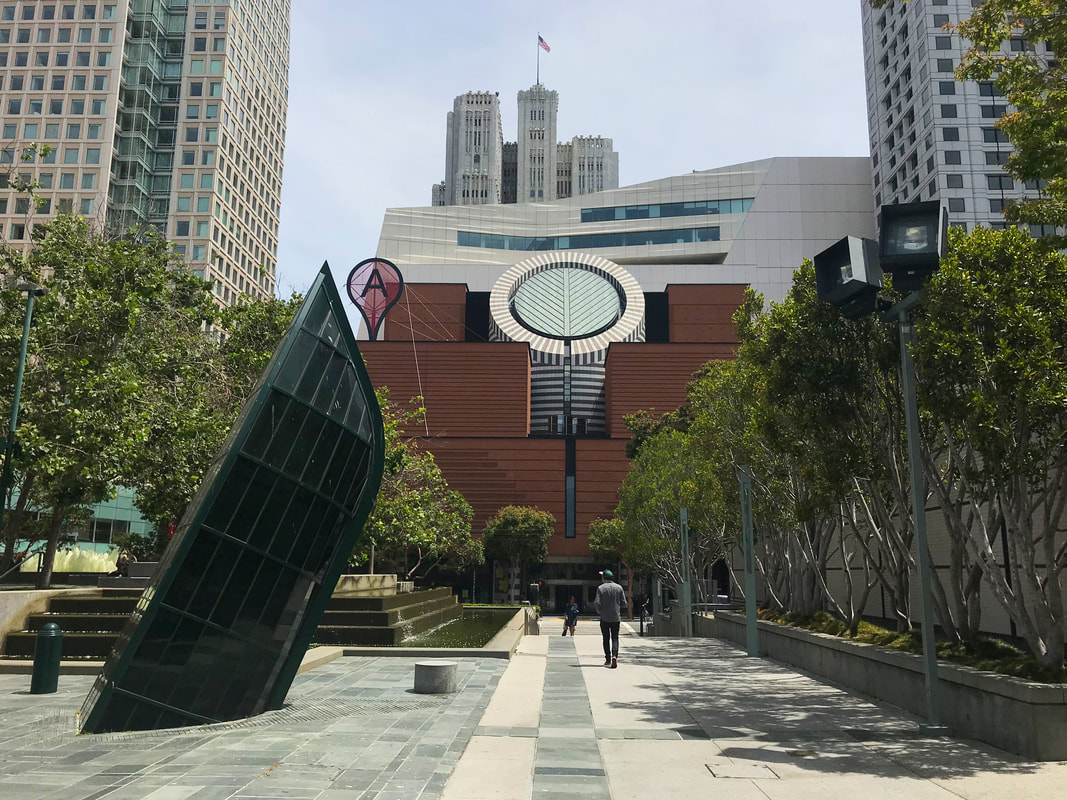 SFMoMA is always a controversial piece. Back in 1935, when Mario Botta anchored his first U.S building on the site, it received certain backlash from the community and some architectural critics due to the post-modern design approach. Fast forward to 2010, the museum assigned Snøhetta for the expansion, they took down many parts of the original building and attached a new volume behind the existing front facade. I think the building has lots of pros and cons. Cons are primarily coming from the fusion of the two distinctive design languages. Stitching a Mario Botta design with Snøhetta's was already an irrational move, but judging from the competition roster: Adjaye Associates, Diller Scofidio + Renfro, Foster + Partners, and Snøhetta, the aesthetic and spatial coherence were never the priorities to the offical. The fact that they did not even try to bring the Architect Mario Botta back for the expansion project already indicated a strong political intent. Here is my chart of pros & cons:
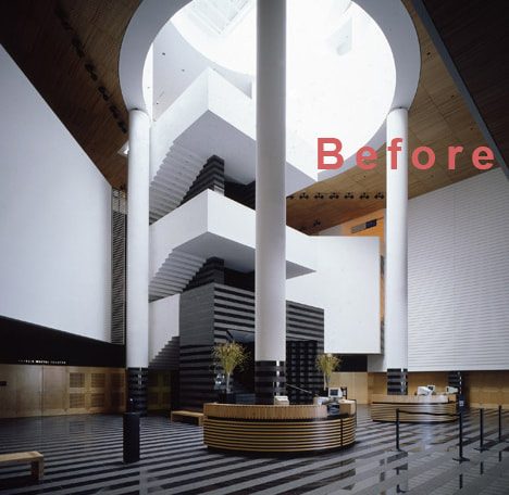
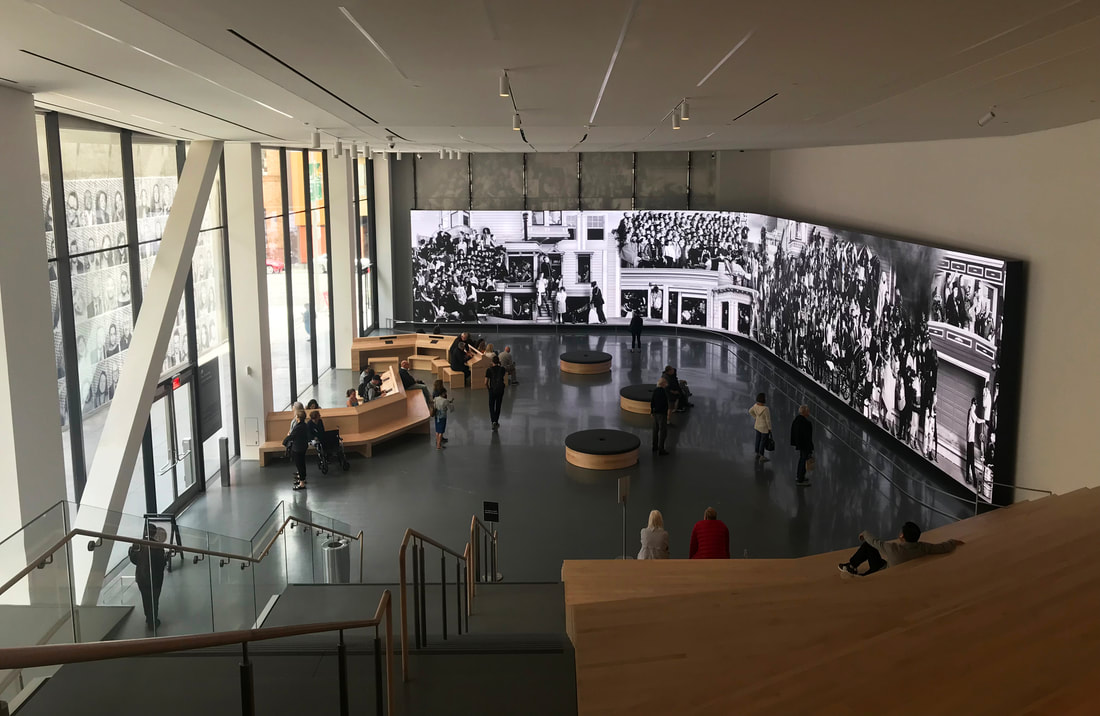
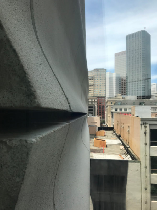
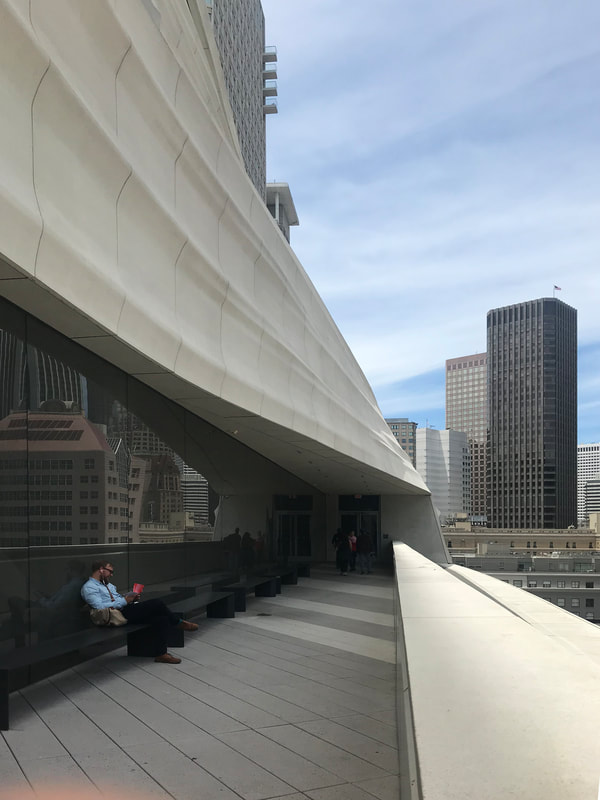
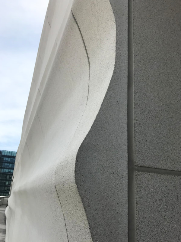
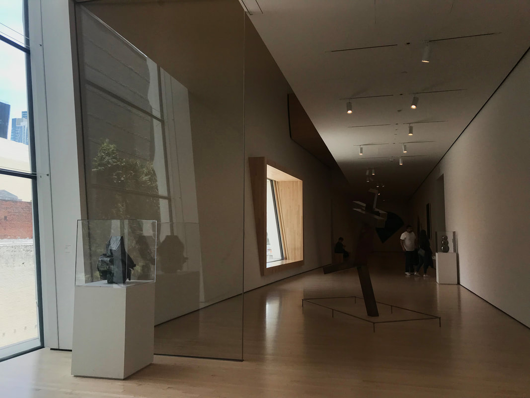
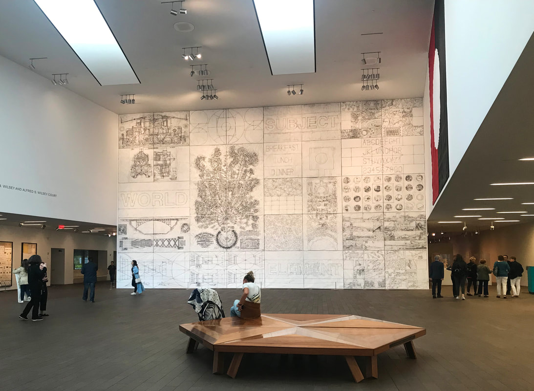
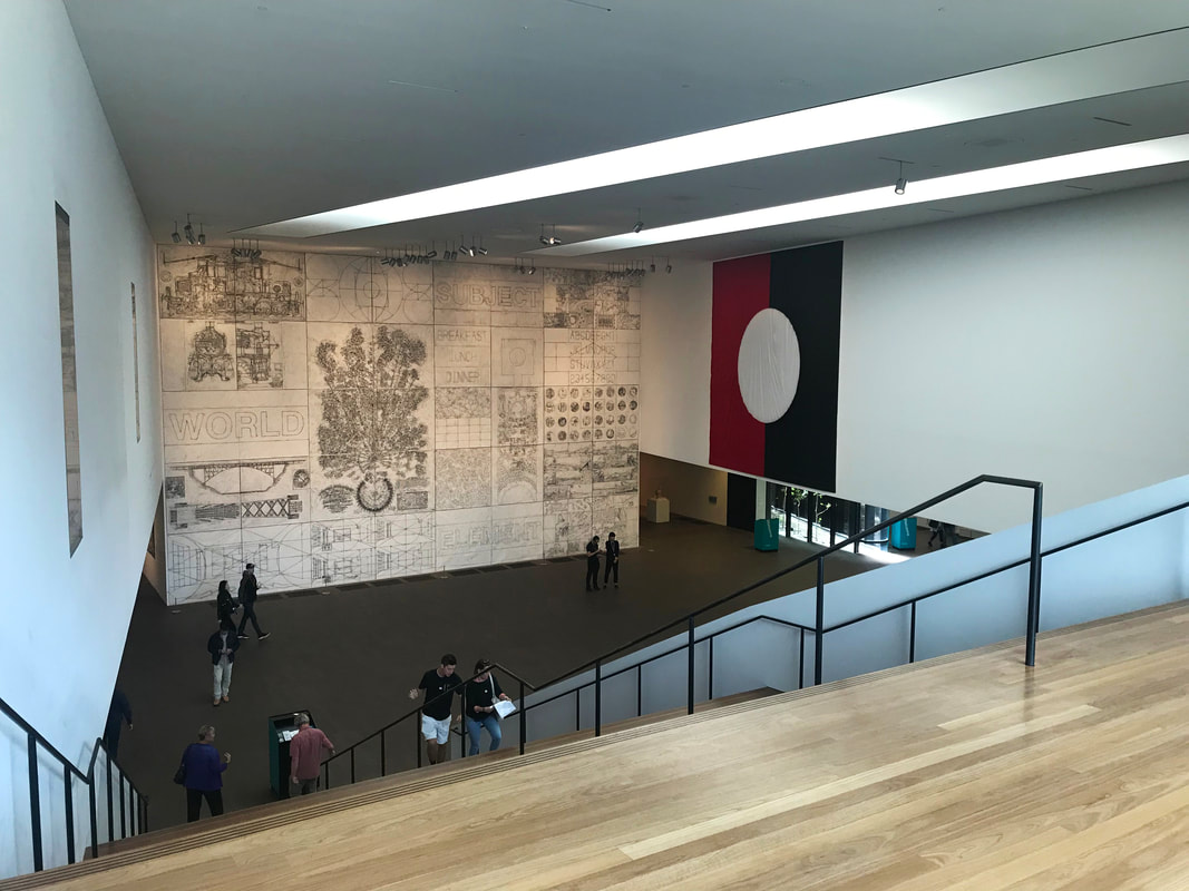
Photograph by Pino Musi, courtesy of Mario Botta Architetto Sketch by Mario Botta, SFMOMA Section from South, 1989  Section by Snøhetta, SFMOMA Section from South 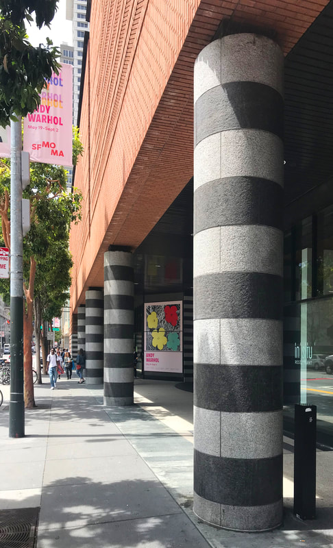 Look at the incredible details from columns to brick facade to ceiling panels. Mario Botta's original building was sacred and monumental. The central stacking staircase ascended people to a different realm like a ritual before they see any art piece, the statement was firm, SFMoMA was a temple of art. It was an extremely difficult task for Snøhetta to do the expansion because the site was very limiting and mimicking Mario Botta's building was impossible. I feel like they soon realized that and had to make the decision of creating their own new narrative for SFMoMA. They tried to make the museum as welcoming as possible with multiple new access points and offset the building on the ground level so it's more friendly to the pedestrians and the city grid. The concept of the new expansion facade is to re-introduce natural elements back into the city, to emphasize on the weather conditions of San Francisco: wind, sun, and rain...etc. Some people also interpreted the facade as the seismic activity around the region. These digi-fab panels, however, leave an abrupt end in the corners, which I think loses that dramatic effect quite a bit. The interior of the museum is rather simple with minimal materiality and color palette, maybe to counteract with the busy exterior and the bustling city. The concept is to celebrate the dynamic landscape of the city so they strategically organized the circulations and tried to use single flight staircase as medium to portray the experience. They grouped most of the public circulation against the facade so visitors can gain a view to the city. That's something Snøhetta does for most of their projects: to allow the building to re-establish its relationship with the existing urban context. 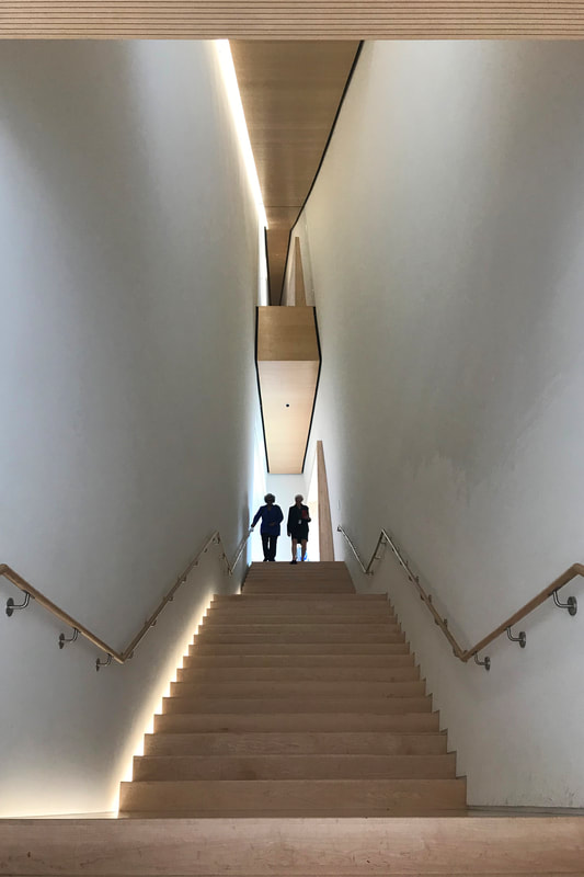  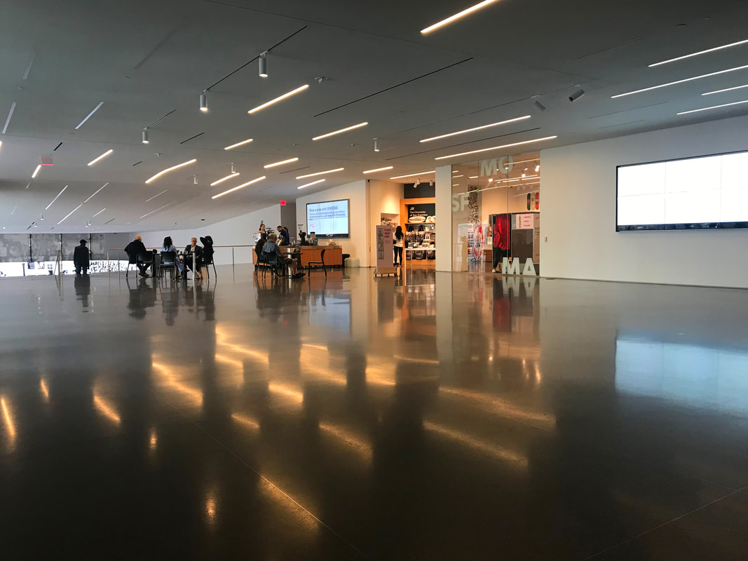 I think there are some program and circulation issues. There are two gift shops and two coffee shops, and each are just a floor apart. I understand one coffee shop is for public and one for private, but I feel like it's loosely planned. It could be something the museum modified on its own without the architect's involvement. 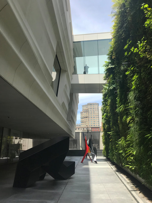 I think the most iconic space is not actually within the museum, but the pocket space between the two volumes. The sculpture garden is a dynamic space composed with many design gestures: elevated ground level, overhang, bridge, and a massive green wall. The space also allows visitors to get a good look at the undulating facade. Overall, I think it is not a good decision to clash two beautiful designs together. The result is rather Frankenstein-esque with many deactivated spaces and disoriented conjunctions. They should have either invite the original designer to do the expansion or completely demolish the old one so Snøhetta can really do what they do best. I think the building does successfully by making art more accessible and reaching out to a broader audience. The museum is now more family and education oriented. It doesn't barrier itself from the current society and the city. Let me know what you think of the SFMoMA! The M. H. de Young Memorial Museum / Herzog and de Meuron 2005 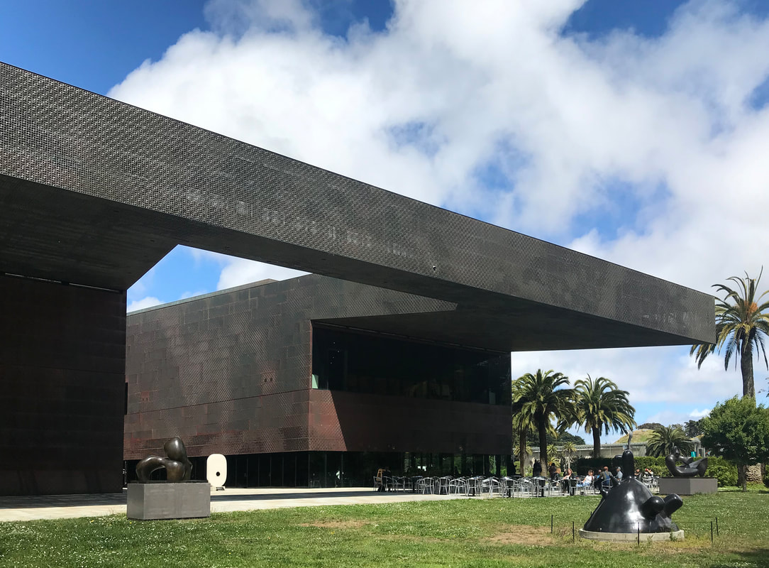 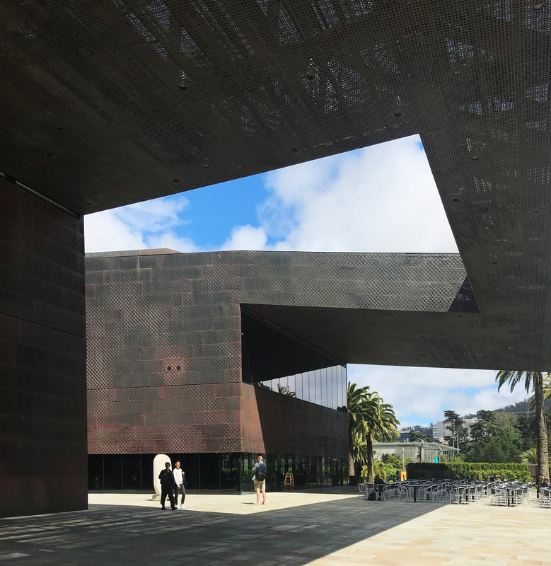 I first visited this building back in 2013 as a college freshman. I was too young too simple to comprehend the building let alone appreciate such masterpiece. The building was designed and commissioned between 1999-2002 right around the time they won the Pritzker Architecture Prize (2001). There was an original de Young Museum on the site before this one, but was heavily damaged during an earthquake in 1906. I don't know the exact detail, but somehow instead of renovate or expand the old building, they decided to remove it and start anew. 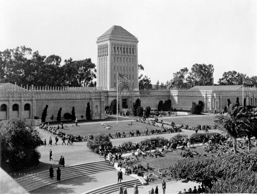 The original de Young Museum  Herzog and De Meuron did not treat it as a tabula rasa however, they still had a very contextual approach. The form of the sculptural building was inspired from the original museum with the horizontality on the ground and a tower to overlook the scenery. The scheme of the project is geographically generated to align with the site contour lines. Furthermore, they kept the original sphinx sculptures, the Pool of Enchantment, and the palm trees from the site. The choice of material is intriguing since back then no other project in San Francisco used weathering steel. It gives the project an earthly tone and also brings out the natural element of the site. I was actually a bit confused with the entrance of the building. It's a bold move to have minimal signage and primarily rely on the architecture itself to direct people. It's as if they don't want you to directly walk into the museum, but encourage us to interact with the building itself and gradually orient ourselves into the space (if you have a confusing entrance for your studio project, 10 out of 10 you get destroyed). 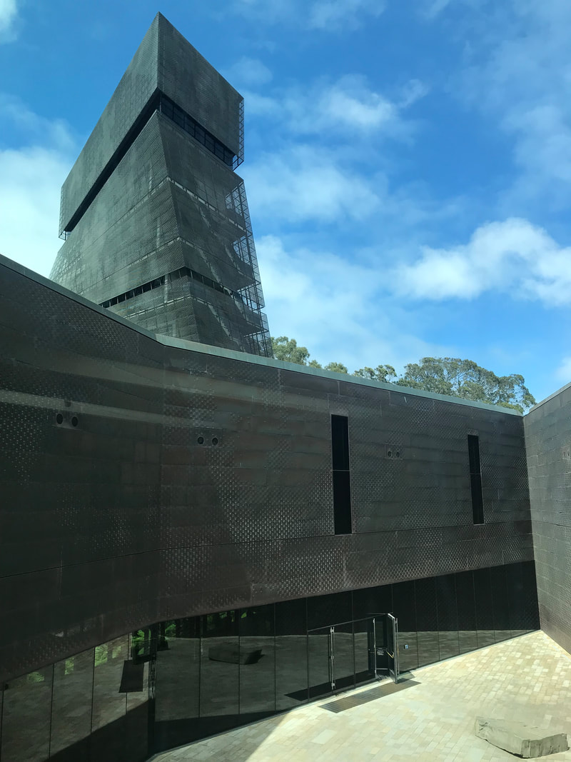 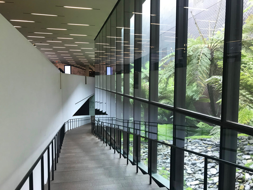 I think the tower is magnificent. It's twisting form generates dynamic looks from different angles, and the translucent mesh facade gives away the silhouette of the egress stairs and tectonics of the tower. What's more, you get to view the city and the whole museum in the tower, and because of that, Herzog and de Meuron also designed the roof top of the museum as another "facade" of the building. It's really something you don't see everyday. Most architects or engineers would just leave all the HVAC system on the roof top, but this building really took it to another level. It's like a grand reveal of the museum itself that allows you to understand the overall scheme. 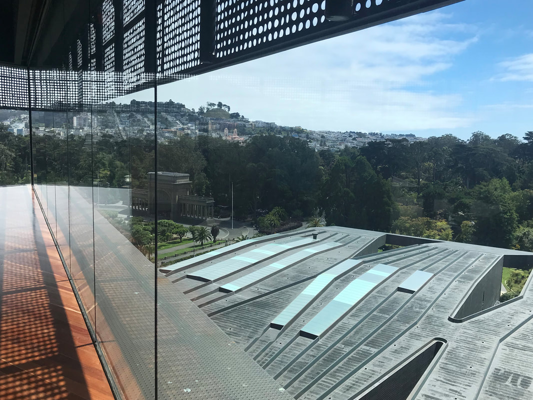 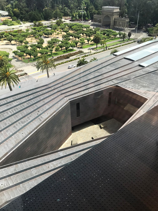 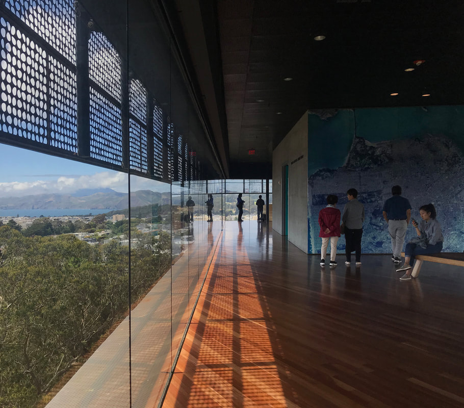 I think this building has a heavy influence on their design decisions later on in the career even until today. The projects I could think of right now that share similar form or scheme are: Tate Modern new wing, the new HD for BBVA, and one of my favorite projects from them, Skolkovo Institute of Science and Technology. Below are some references of those projects. 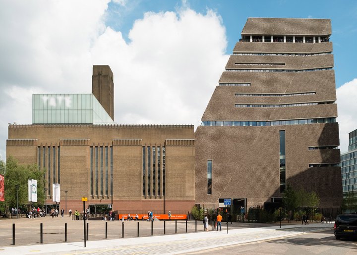 Tate Modern / Photo by Jim Stephenson 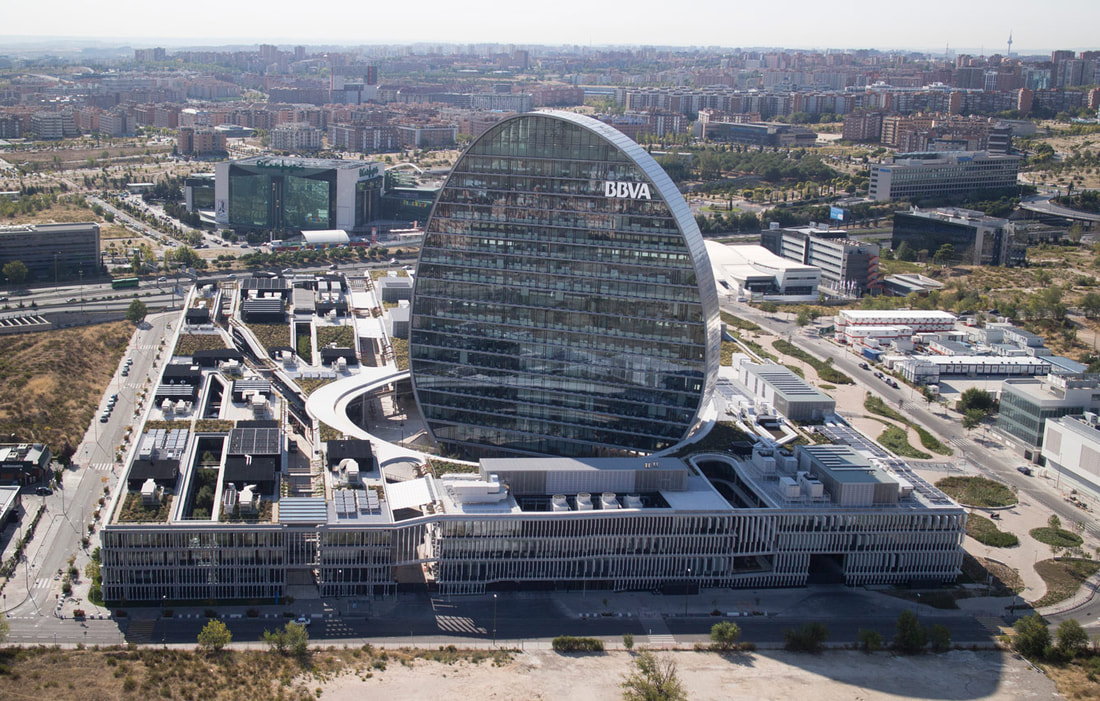 New HD for BBVA / Photo from Herzog and De Meuron Website 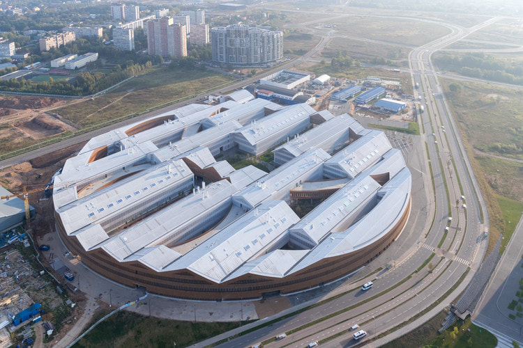 Skolkovo institute of science and technology / Photo from Archdaily by Iwan Baan The organization of the parallel spaces is a good way of creating spatial transparency and using the site efficiently. The in-between pockets can be used as circulation or courtyard gardens. Make sure to check out their lectures online if you want to learn more about their design techniques. Above is a keynote from Pierre de Meuron at Moscow Urban Forum that just came out couple days ago! There is the California Academy of Sciences building by Renzo Piano right in front of the de Young Museum, but due to the length of the blog post I decided not to cover it. The building is definitely worth the visit! Contemporary Jewish Museum / Daniel Libeskind 2008 This project also has an existing building on the site, but instead of doing a slow dance on the context and carefully avoid stepping on each other, the old and the new merged into a whole new identity. The highly controversial architect Daniel Libeskind was not afraid of creating an urban spectacle of his own. 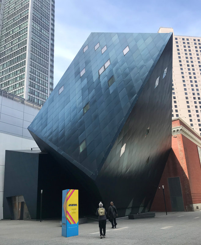 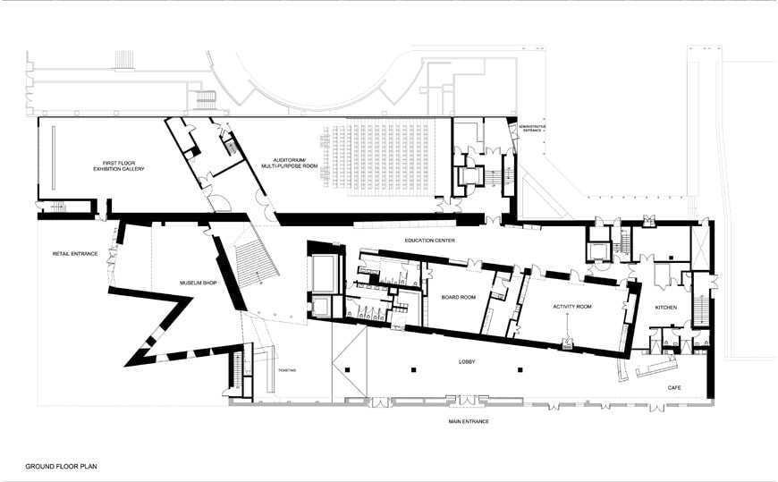 I think we can see a trace of influence from his mentor Richard Meier and perhaps Peter Eisenman on the Deconstructivism side. The multi-axial floor plan was a result of the juxtaposition of the schemes. The protruding shards popped out from the existing building and created a new composition in the exterior. 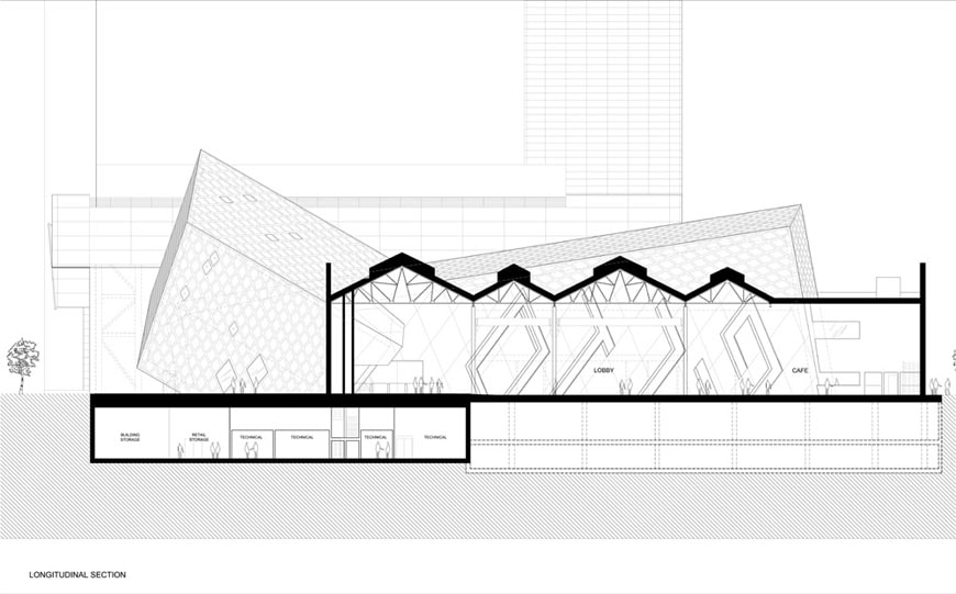 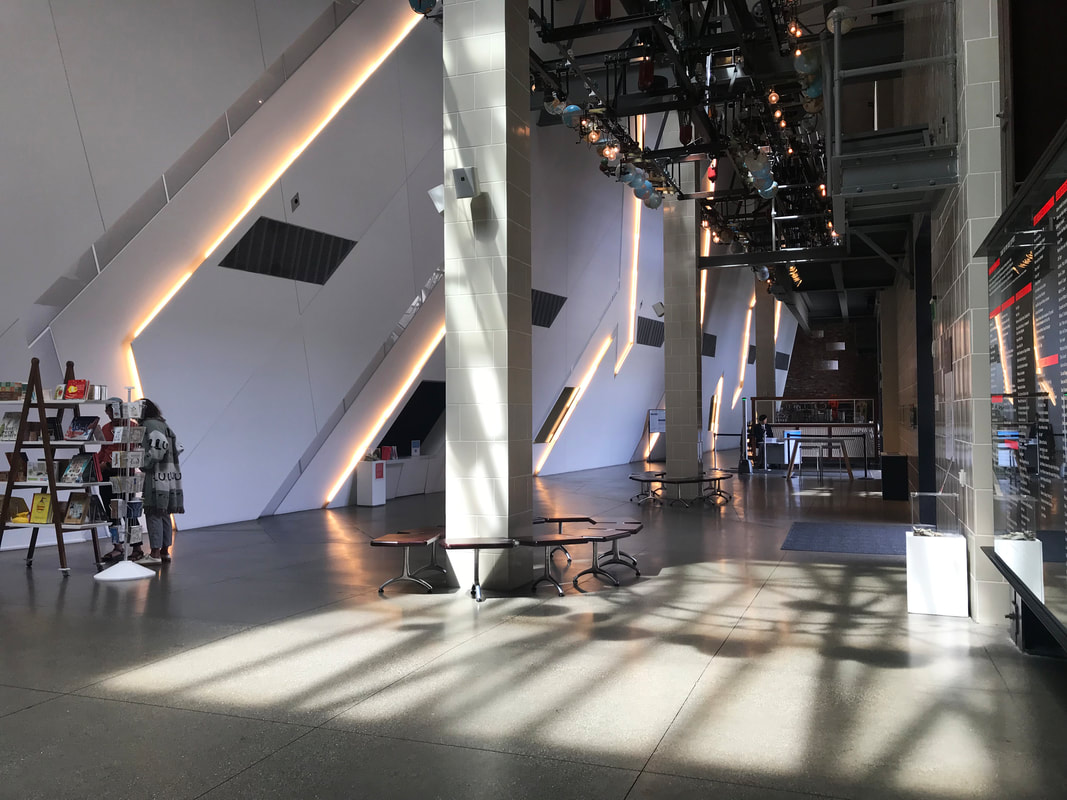 Several iconic Libeskind design languages can be seen here with the geometric patterns and overlapping sharpe edge cubic volumes. The lobby can be a little bit disoriented due to the placement of the wall, but the spatial drama on the second floor is superb. 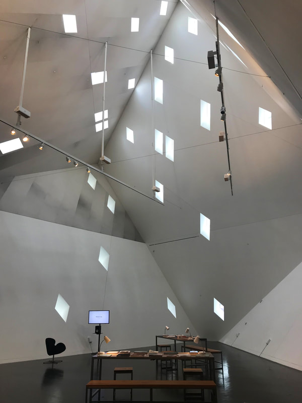 This project was designed and constructed around the same time as the Royal Ontario Museum in Canada (2007). Later on in 2011, the Military History Museum in Dresden, Germany also followed similar design strategy with new addtion juxtaposed over the old existing building. 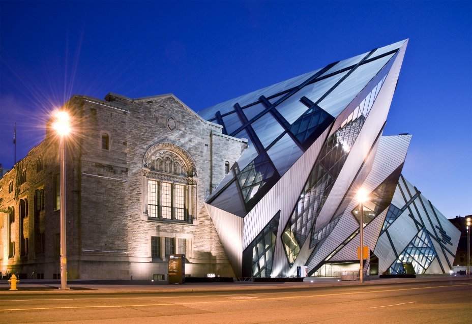 Royal Ontario Museum / Courtesy of Studio Daniel Libeskind  Military History Museum / Courtesy of Studio Daniel Libeskind We got SFMoMA, de Young Musem, and the Contemporary Jewish Museum: three projects, three conditions, three different approaches! Once again, architecture is extremely open-ended. What are your thoughts on these projects? San Francisco  Here we are at the second part of the blog post, thanks for staying until now! For this second part, I want to discuss about the city itself. I learned a lot more about urban planning and urban conditions in grad school classes as well as teaching the Sophomore studios, and that affected how I travel nowadays. Instead of solely focusing on individual buildings, I now also broader my attention to the urban environment. I've been reading this book 'How to Kill a City: Gentrification, Inequality, and the Fight for the Neighborhood' by Peter Moskowitz while traveling and it gave me a level of awareness. It made me realized I was touring around the modern day dystopia, that there are two parallel lives coexisting in the city: one is the young, cultural and hipster San Francisco and the other one struggles on a day-to-day basis. We always watch those cyberpunk movies, where the big corporations own everything in the dark polluted future with most people live in stacked urban slum, well, this is kinda it.
 It's a very heavy subject, and there's not really a solution for it. And the problem wasn't just occur in San Francisco, it's spreading all around the Bay Area. The rising rents causing gentrifications can severely destroy a community. I too, feel guilty after reading the book because I also went to the Mission neighborhood (a Latino district) as a tourist and supported the boutique coffee shop and fancy bakeries, which none of the people living there can gain profit from. Above every sophisticated stores, there are families living in a 10' by 10' room with agency harrassing and trying to kick them out so they can sell the Latino culture to all the people visiting San Francisco. "In the same way that the suburbs were once inaccessible to the poor, in the near future American cities will become gilded jewel boxes, and the exodus of the poor to the suburbs will continue unchecked - that is, until the rent gaps in cities become too small to make gentrification profitable, and a new form of spatial filtering begins." -Peter Moskowitz If you want to learn more about the situation and appreciate good cinematography, then check out 'The Last Black Man in San Francisco'. The movie itself is a form of protest. The black population of San Francisco is down to 5.8 percent of the city, which is less than half of what it was in 1970. The new San Francisco is becoming less and less diverse. The movie just came out this summer. I've attached the trailer below!
0 Comments
Leave a Reply. |
AboutThis blog was launched in August, 2015 during my 8th year of studying abroad in Barcelona, Spain. I decided to start this blog and record some of my thoughts and moments. This blog is also dedicate to Richard Fu, a good friend of mine who is now guarding me from above. He inspired me to get out of the comfort zone and be curious about the world. Amig@'s blogs
Check out my brother Will's blog (in Mandarin) to see what he's up to these days (Design, fashion, food, technology, music, film...etc) Check out Kris' website for some high quality photos around the world Archives
September 2023
|

 RSS Feed