|
Museo Soumaya / 2010
The museum is designed by Architect Fernando Romero of fr-ee architects and commissioned by Carlos Slim, who is the richest person in the Mexico (his net worth is equivalent to about 6 percent of Mexico's gross domestic product). The architect worked with Arup and Frank Gehry on the structural engineering and construction. The museum houses enormous collection of art works owned by Carlos Slim. The purpose of the museum is to increase the "humanistic capital" of Mexico City. The museum provides free admission for everyone, and was the most visiting museum in the world in 2013. 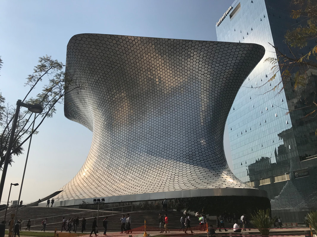
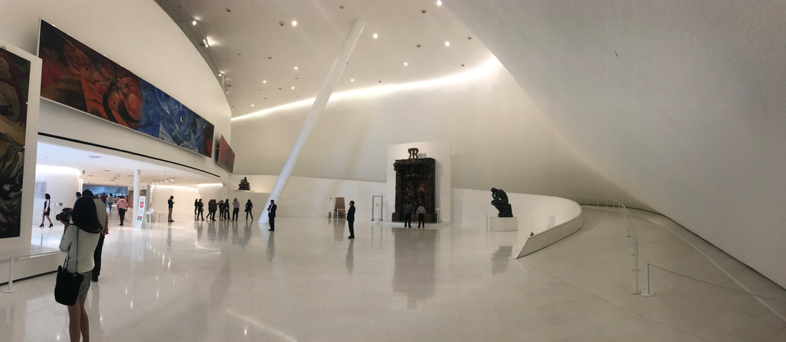
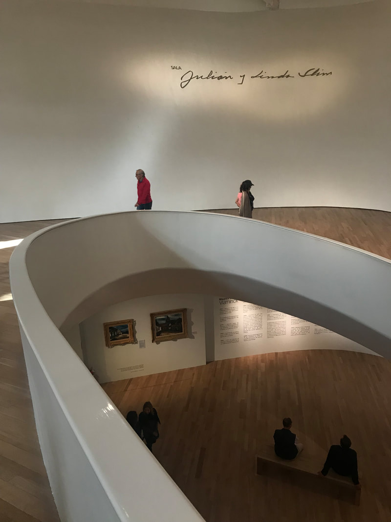
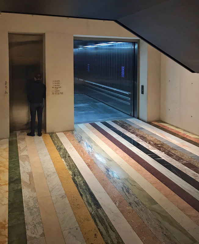
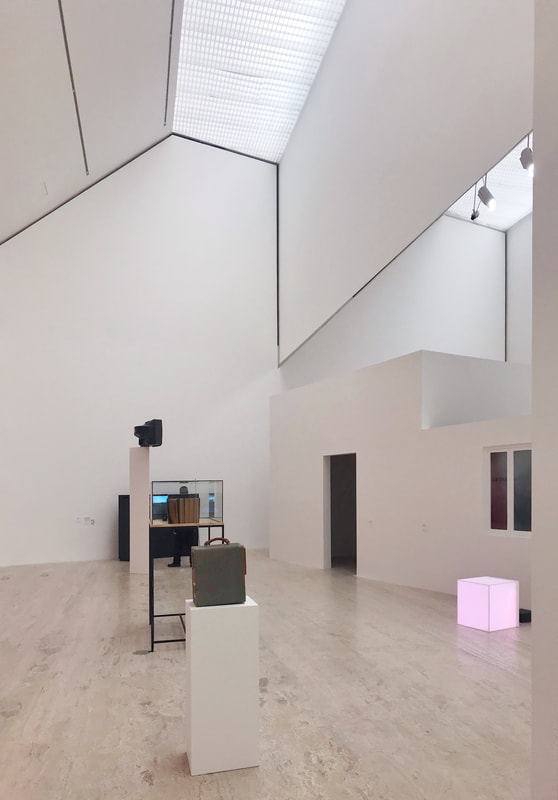
A clean double height lobby space right after you enter the museum. The architect keeps it minimum on the color palette and materiality, the space is more for the art collections.
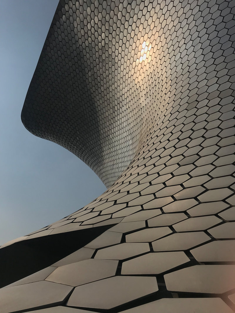
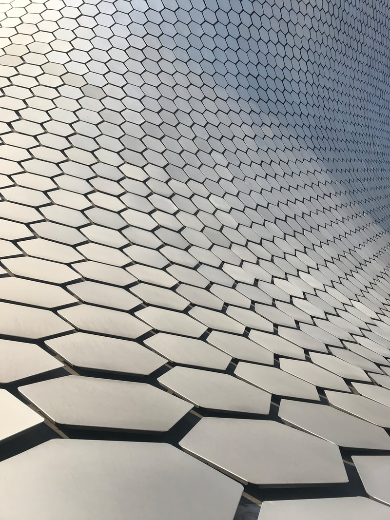
The museum has the core in the center, and uses ramps for major circulations. The building has very open floor plan for the art display. The entire vortex volume is sitting on a podium that serves as the back of the house. The museum also doesn't have any single glazing except one skylight on the very top level for easier control of lighting condition and art piece preservation.
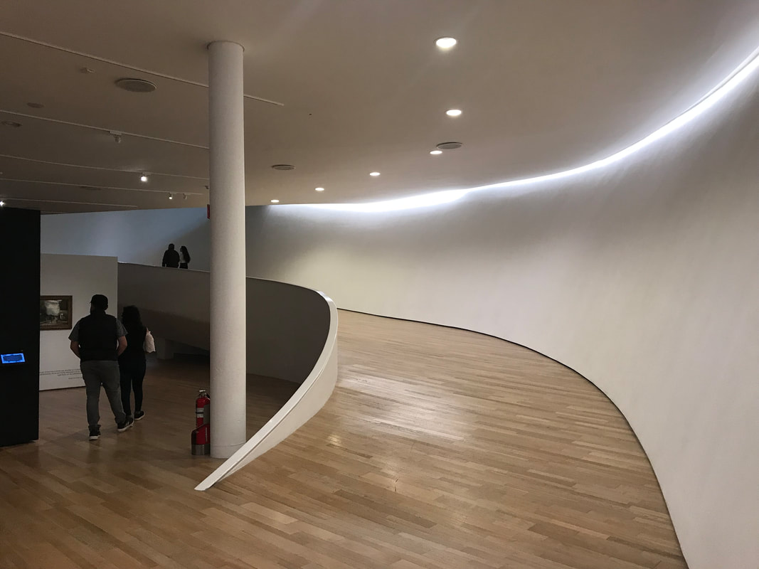
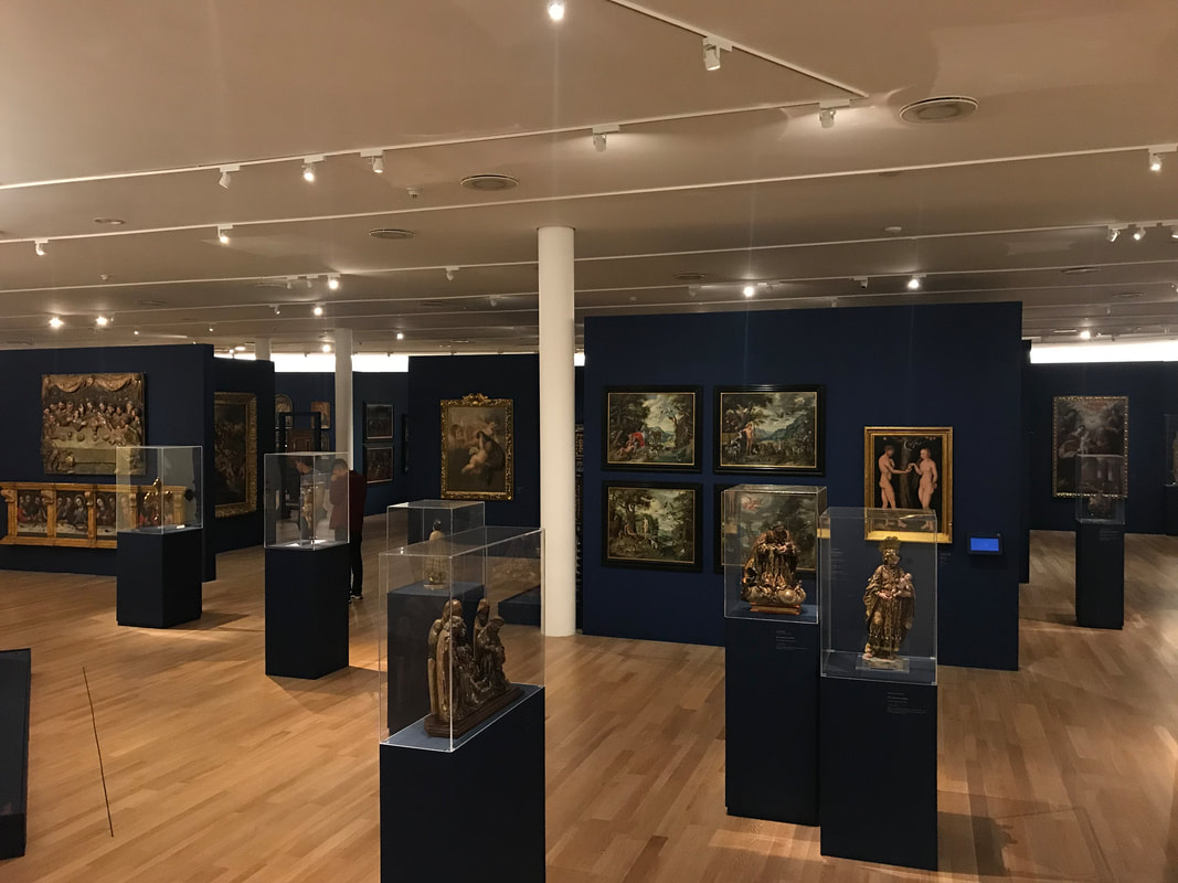
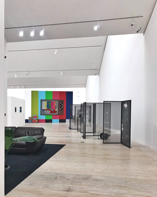
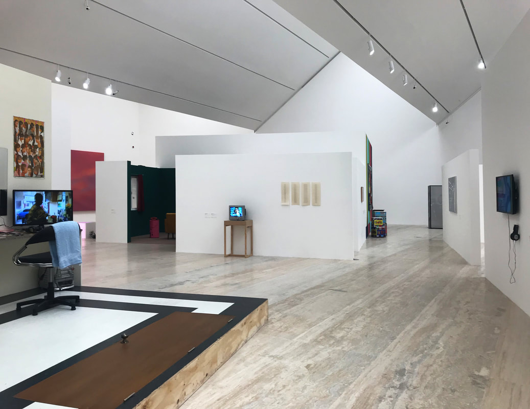
In my opinion, I think some floors are better than others in terms of the exhibition experience. A massive collection of art can sometimes be a little overwhelming for the visitors. The open floor plan doesn't indicate the exhibition sequence, which can be disorienting as well.
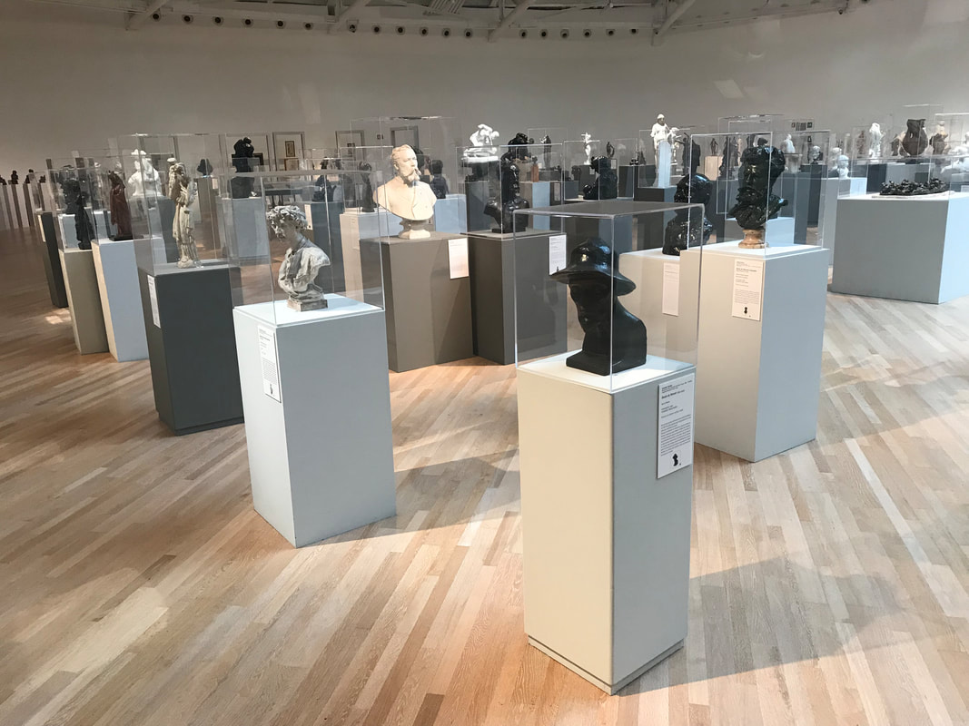
For exmaple, on the highest level, it is an entirely open floor with abundant of sculpture collections, which hinders the visitors' experience with each art piece. The visitors can easily lose focus on the sculptures themselves.
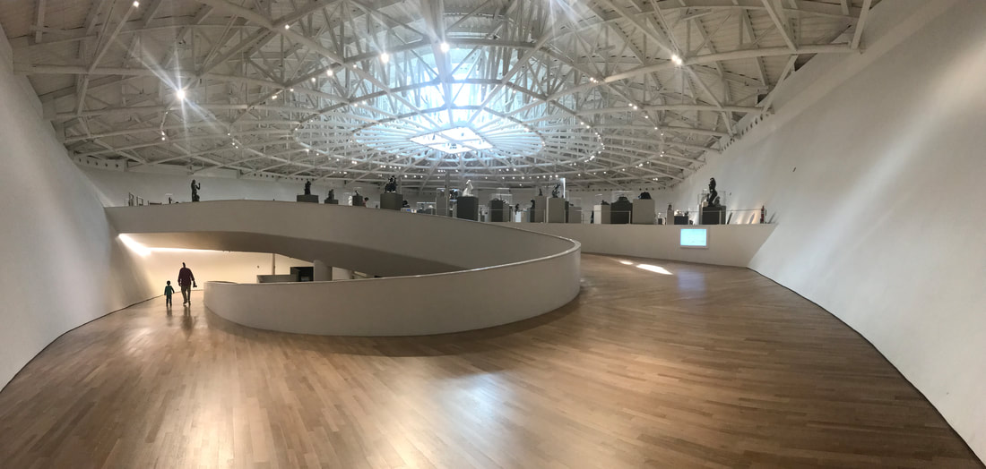
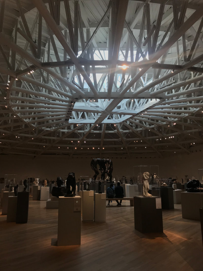
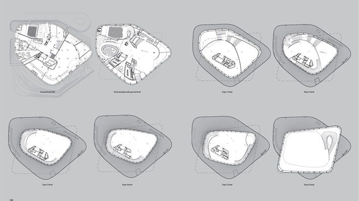
Image from Archdaily
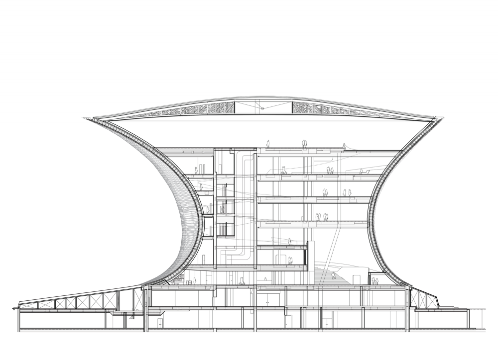
Image from Archdaily
Overall, it is a great museum that can drastically increase art awareness and appreciation of the citizens in Mexico City.
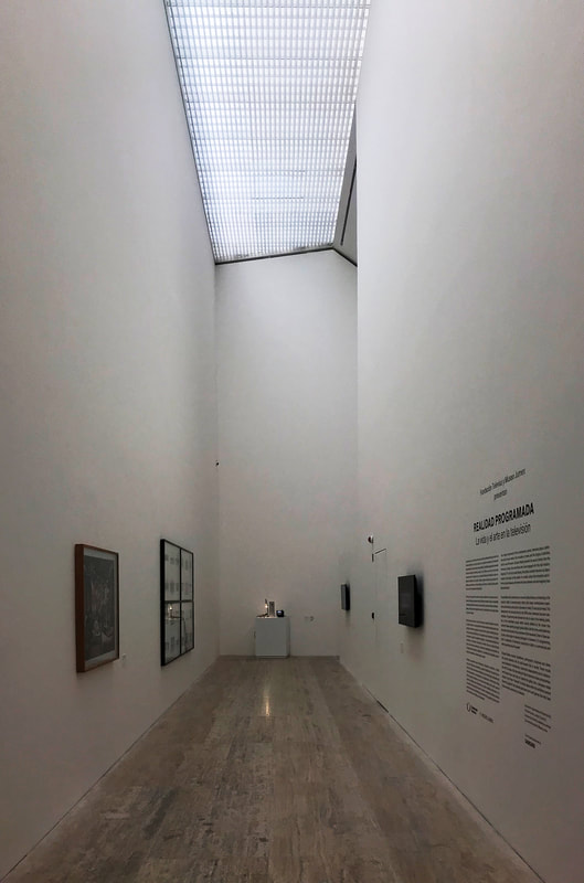
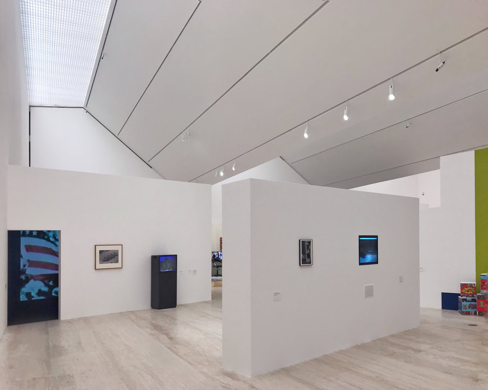
Museo Jumex / 2013 Museo Jumex is designed by the English Architect David Chipperfield. I learned a lot about the architect from my last year's internship in Taiwan. The architect stated that in order to have a presence on the small site surrounding by all the tall buildings, the museum itself has to have a heavier volume and opaqueness. The result is a stacking block with well defined edges and roof geometries. 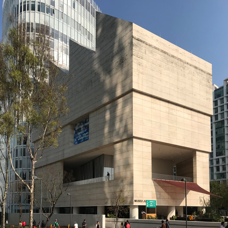
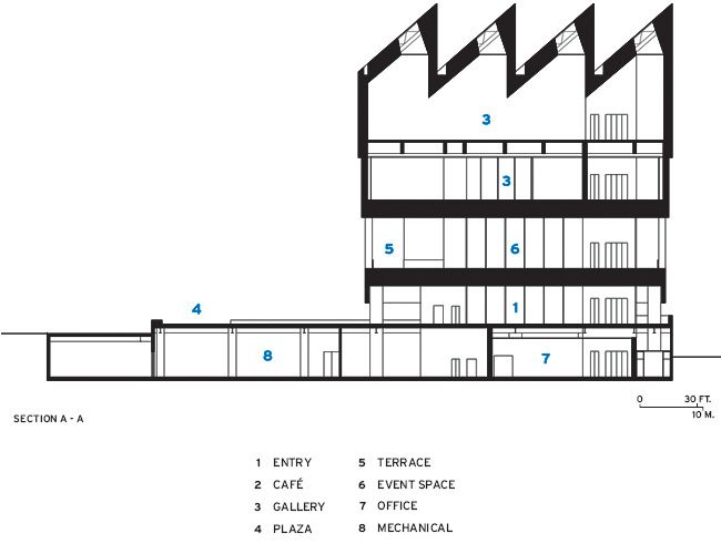
Image from Archdaily
In order for the form to read as a solid volume, the architect offset the programs to make it seems like the spaces are carved in. Each stack has different heights to create a visual hierarchy. For more information feel free to watch the interview below.
The small plaza of the museum is also up for exhibitions and installations. There is a installation currently going on that creates a public space.
Basement
The Architect David Chipperfield is also known for the use of stones. Here are some of his other projects:
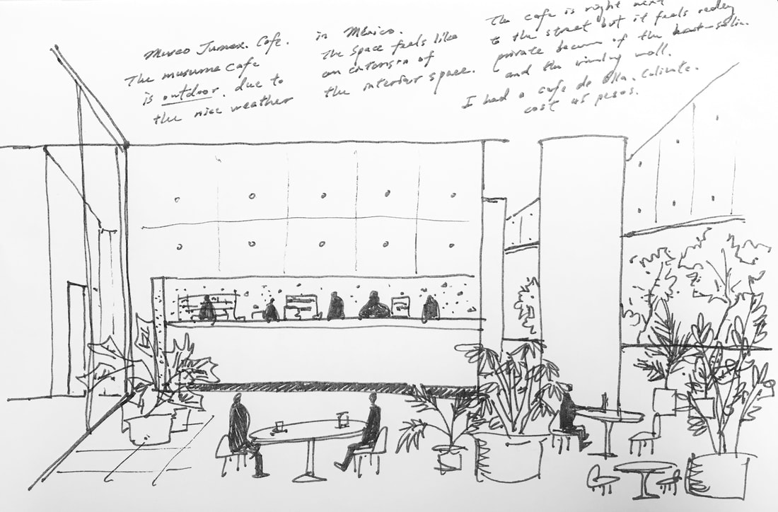
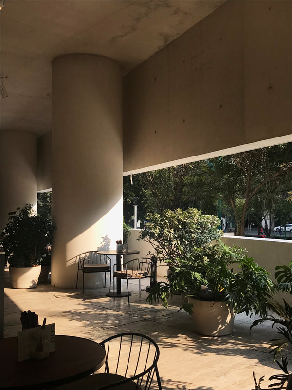
One amazing design about the museum is the fact that the cafeteria is outdoor. The architect designed the building according to the local climate condition, and was able to pull out the program to exterior. Even though the cafe is outdoor, but it is still covered by the second floor and feels like a private space.
Stay tune for part 3!
0 Comments
Leave a Reply. |
AboutThis blog was launched in August, 2015 during my 8th year of studying abroad in Barcelona, Spain. I decided to start this blog and record some of my thoughts and moments. This blog is also dedicate to Richard Fu, a good friend of mine who is now guarding me from above. He inspired me to get out of the comfort zone and be curious about the world. Amig@'s blogs
Check out my brother Will's blog (in Mandarin) to see what he's up to these days (Design, fashion, food, technology, music, film...etc) Check out Kris' website for some high quality photos around the world Archives
September 2023
|


 RSS Feed